Format MS Word Like a Ninja Super Hero!
View more documents from gwyneth jones
Does it ever seem that when your students go into the computer lab to compose & to write they've forgotten EVERYTHING they ever learned about formatting their MS Word documents? You get docs with wonky space bar spacing, 18pt comic sans (ick!), left justified headings, and strangely double spaced pages! Eeep! I know, right? I see proof of this working with my teachers, walking through the lab, and when kids come to me in the library to print out their work in the mornings & it's an assortment of crazy ill-spaced, scary fonted, and oddly sized docs, docx, and rtfs!
Does it ever seem that when your students go into the computer
 lab to compose & to write they've forgotten EVERYTHING they ever learned about formatting their MS Word documents? You get docs with wonky space bar spacing, 18pt comic sans (ick!), left justified headings, and strangely double spaced pages! Eeep! I know, right? I see proof of this working with my teachers, walking through the lab, and when kids come to me in the library to print out their work in the mornings & it's an assortment of crazy ill-spaced, scary fonted, and oddly sized docs, docx, and rtfs!
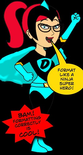 JONESing for a Rescue!
Yeah, I went there. So, one of my awesome new (to MHMS) teachers Mr. Justin Jones (no relation) came up with a comic tutorial for this! And after a little collaboration & tweaking we'd like to share it with you!
We've created both a colour version for those of you who have unlimited colour printing (yeah, not us! LOL) and Black & White versions for printing hard copies. Both are posted on our Edublog nominated (Squee!) Daring Tech Wiki. Sure there are other MS Word tutorials out there but we wanted something visual & short that hit most of the "worst offenders" and MS Word formating faux pas!
Punch 'Em For Binders!
We've printed out 30 copies of the B&W hard copy, laminated them, & are keeping them in our computer lab for quick reference! We've also made available to the staff by request, classroom sets. The B&W version also has a heftier margin than usual so that they can be 3 hole punched & students can put them into their binders.
Steal These Comics!
We've decided to (as always!) to make these comic tutorials Creative Commons Share Alike Attribution Non Commercial so that others can benefit from them. Of course any suggestions, corrections, and additions are welcome! So, I guess it's not *really* stealing but taking! All versions of these comics are on our Edublog nominated Daring Tech Wiki, they can also be found as PDF's for download on my Slideshare, and as .jpegs on my Comic Tutorial Gallery on Flickr.
Committing Formatting & Fontacide!
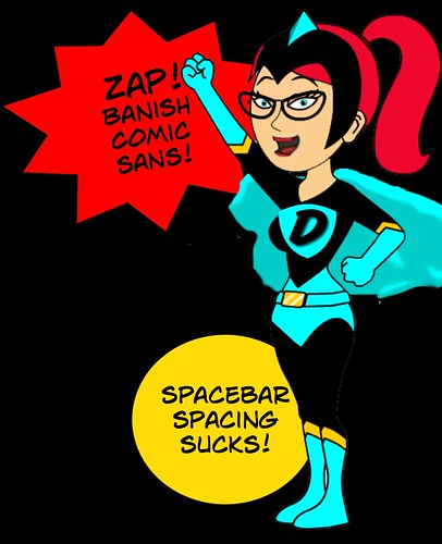 I'm on a personal mission to banish the font Comic Sans from use. Has there ever been a more overused, tiresome, & insidious font? GAH! I can't even look at it! The next in line for Fontacide© are the fonts Jester & Marker Felt. People! Please let's let go of these tired fonts! (ok, clearly I have font issues & I need to save this rant for a whole separate blog posting! Maybe I'll call it I Want to Lick That Font)
Another thing we gotta banish with our students is using the spacebar to move things around. OMG...it's terrible! I hate it when we have to go back and fix those broken lines... Let IT WRAP, kids! Wrap it, wrap it good!
More Comics!

So, dear readers....what did we miss on the Comic? Suggestions, corrections, additions? What EdTech conundrum drives you crazy? Would love your feedback in comments. Cheers! Oh! And thanks to all who took the time to vote for us for the Edublog Awards! Whether we win or lose I really appreciate & value our readers!...and here's my last shameless pitch for votes! LOL

If you've enjoyed this post or are a reader of this blog & find it useful please consider voting for us for Best Librarian / Library Blog - Voting Ends Tuesday 11:59pm EST.


Love it - voted a few days ago!!!
ReplyDeleteAww thank you, Marie!! It's not like I'm competitive but losing by only 16 votes? Oh yeah, next time - if there ever is a next time! I'm gonna hire Donny Deutsch, the Goodyear blimp AND maybe even some airtime on Bravo! LOL
ReplyDeleteLove your support, hon though seriously!
~Gwynnie